


The vision of the elderly generally declines, and their ability to discern details and text is reduced, so the font size and contrast of the label are key considerations.
@2016 Visual Design


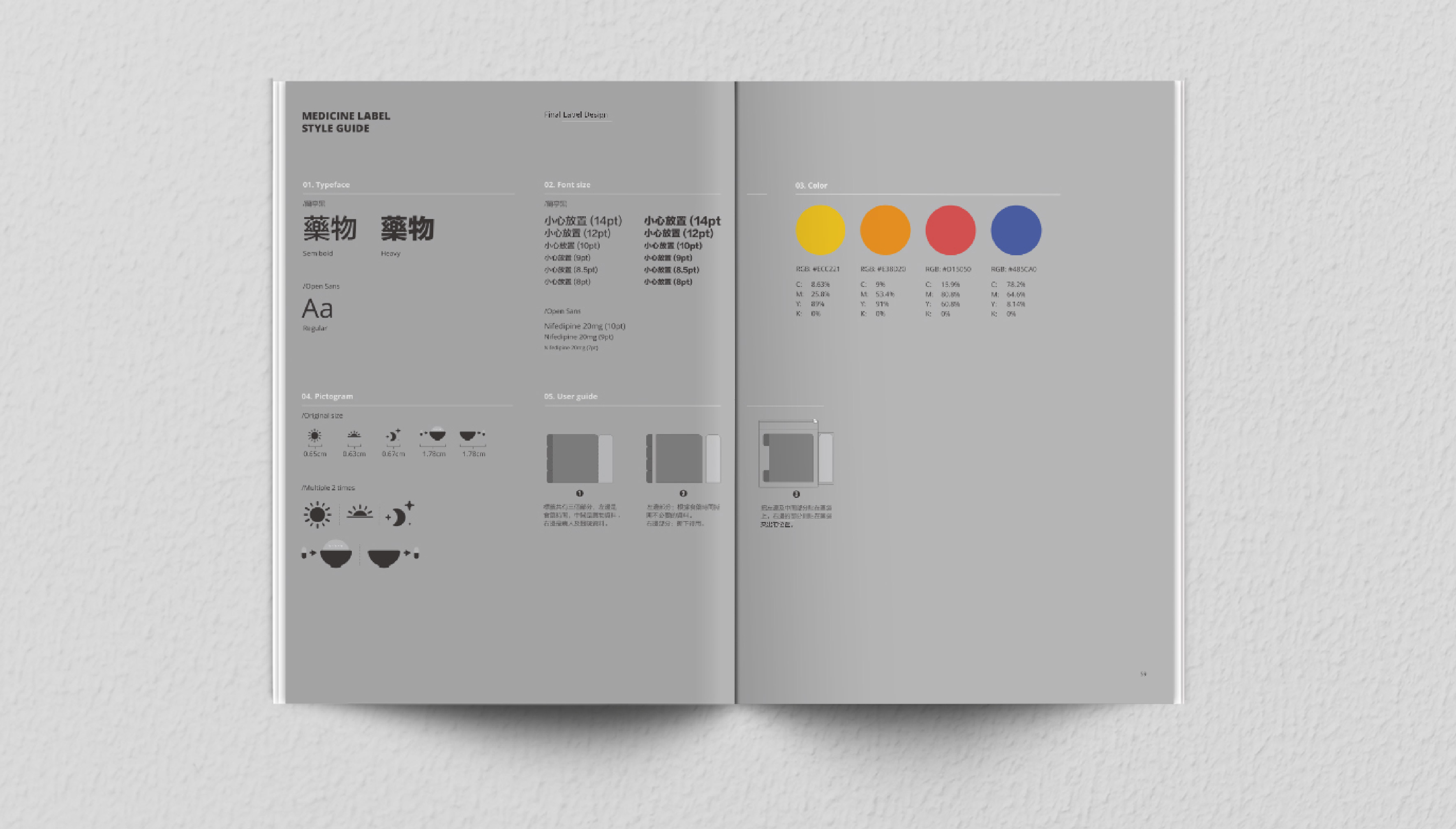
Our design philosophy is "clear, simple, and easy to use." By enlarging the font, increasing contrast, and using concise and clear text and icons, we aim to ensure that the elderly can easily read and understand the information on the drug labels.


In addition to basic label design, we will also consider the practicality and convenience of the label. For example, we can add a tear-off section to the label as a reminder card for daily medication.


Through in-depth research on the visual characteristics and cognitive needs of the elderly, we successfully designed a simple and easy-to-understand drug label. This label is not only highly readable and understandable, but also fully considers the usage habits and convenience of the elderly.
We hope our project can bring you some inspiration and joy.


