Keep your logo simple and avoid overly complex or confusing designs
@2019 Brand Design

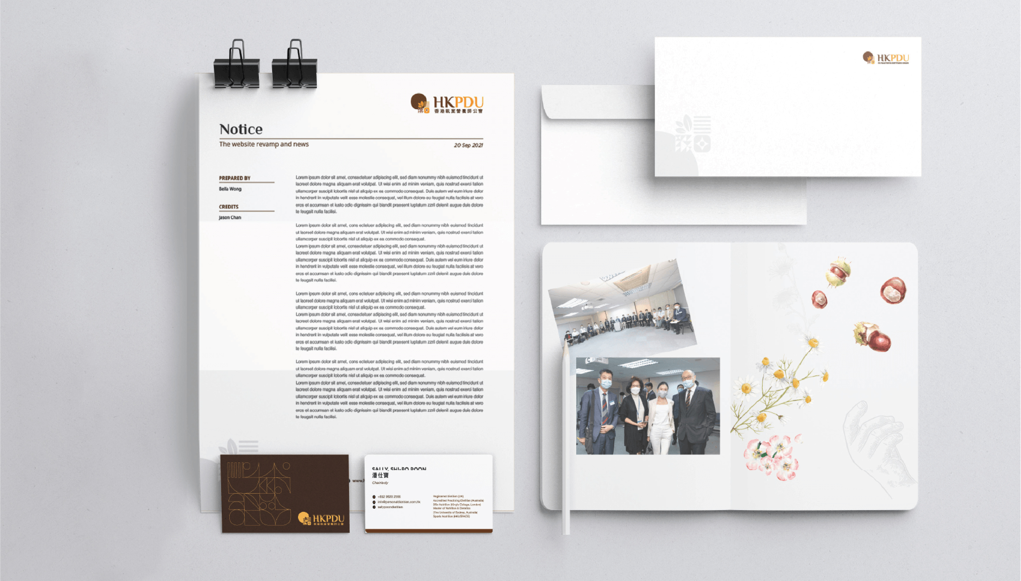
It emphasizes the importance of healthy eating and reflects the passion and focus of a team of professional nutritionists (HK Practising Dietitians Union) on healthy eating.

The LOGO adopts a simple and powerful design style. The font design is clear and easy to read, which is consistent with the brand image. The design of graphic elements also fully considers the fit with the brand concept.

The text information is clearly laid out, and the font size and color are reasonably chosen, making it easy for users to read.The button design is concise and clear, in line with modern design aesthetics.

In different scenarios, LOGO can effectively convey the core concept and characteristics of the brand.


The core concept and characteristics of the brand are integrated into the LOGO design, and the brand image of health, professionalism and unity is conveyed through simple and powerful visual elements and color matching.
We hope our project can bring you some inspiration and joy.